
The everyday art and inspiration of artist Jennifer Georgeadis.
About Jennifer
Follow Azure Dragonfly on Twitter:

Drop me a line and say hello!
info@azuredragonfly.ca
February 1, 2022
I was eager to dive right into my second portrait, and although it was the
first drawn independently of class, I followed the exact same steps as before,
beginning with simple shapes and assuring all proportions were correct before
moving on to modelling the features. For this model’s skin tone I used the
paper colour much less, and utilized my grayscale tool often to ensure I
stayed on track with tone:
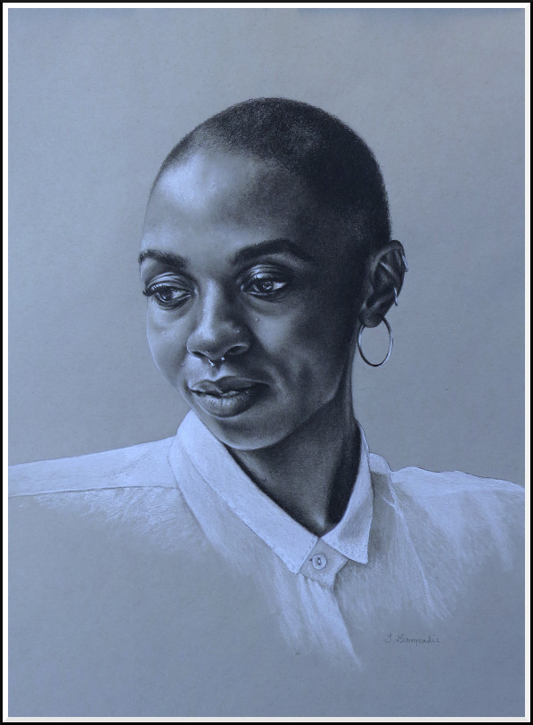
©2022 Jennifer Georgeadis. 45cm x 50cm, graphite and charcoal on Canson toned paper
My third portrait was very special to me. The children in the image are my sister and I at ages six and four, and the portrait was drawn as a gift for my sister’s birthday last year. With this drawing I learned quickly just how challenging it is to draw the smooth skin and rounded features of very young children. I found that I had to be very careful to keep my shading flawless and very gradual so that shadows didn’t translate into dirt or texture that wasn’t actually there!
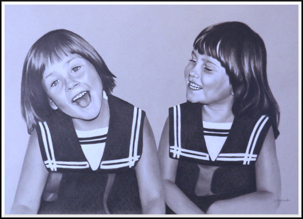
©2022 Jennifer Georgeadis. 53cm x 47cm, graphite and charcoal on Canson toned paper
©2022 Jennifer Georgeadis. 45cm x 50cm, graphite and charcoal on Canson toned paper
My third portrait was very special to me. The children in the image are my sister and I at ages six and four, and the portrait was drawn as a gift for my sister’s birthday last year. With this drawing I learned quickly just how challenging it is to draw the smooth skin and rounded features of very young children. I found that I had to be very careful to keep my shading flawless and very gradual so that shadows didn’t translate into dirt or texture that wasn’t actually there!
©2022 Jennifer Georgeadis. 53cm x 47cm, graphite and charcoal on Canson toned paper
March 16, 2021
The past year has been very weird for everyone of course, but for me it involved
several months of the artist’s version of writer’s block. I was patient and eventually
that eased up (thankfully!), and last fall I felt ready to get back into the swing
of things with colour-saturated alcohol inks, which was fun and very creatively freeing.
Since I haven’t had much in the way of commissions over the past twelve months, I’ve spent my time volunteering and learning some new skills. One of those skills is portrait drawing, something that I’ll admit I’ve found to be a lifelong challenge. When I was offered a portrait drawing class as a gift from my husband, I jumped at the chance, and enrolled in Vitruvian Studio’s online class. The class is absolutely fantastic, and I’d recommend it to anyone who’s interested in developing their portrait drawing skills. (I’m not affiliated in any way with the studio, I just need to give credit where it’s due!)
This is my first portrait from the class, and the process was so enjoyable that I couldn’t wait to start the next one, which is already in progress!
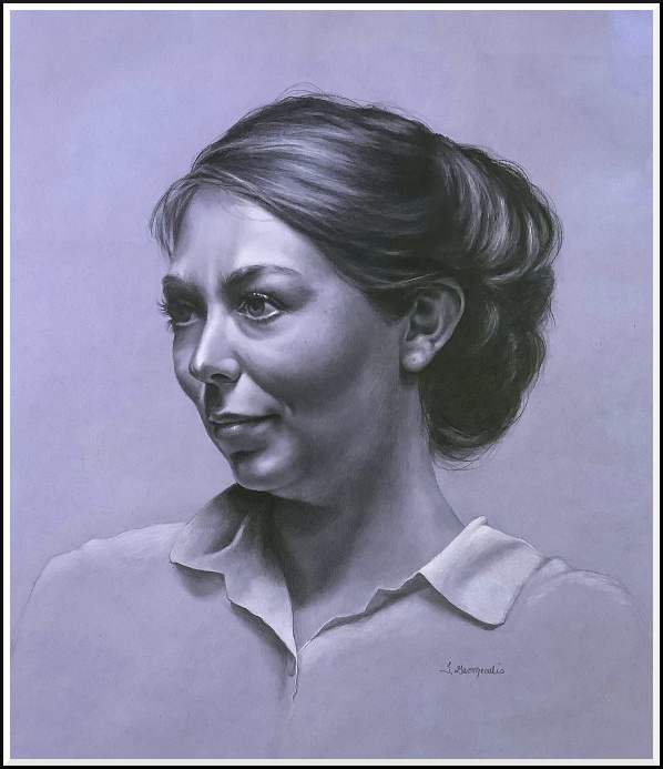
©2021 Jennifer Georgeadis. 45cm x 50cm, Canson toned paper
Since I haven’t had much in the way of commissions over the past twelve months, I’ve spent my time volunteering and learning some new skills. One of those skills is portrait drawing, something that I’ll admit I’ve found to be a lifelong challenge. When I was offered a portrait drawing class as a gift from my husband, I jumped at the chance, and enrolled in Vitruvian Studio’s online class. The class is absolutely fantastic, and I’d recommend it to anyone who’s interested in developing their portrait drawing skills. (I’m not affiliated in any way with the studio, I just need to give credit where it’s due!)
This is my first portrait from the class, and the process was so enjoyable that I couldn’t wait to start the next one, which is already in progress!
©2021 Jennifer Georgeadis. 45cm x 50cm, Canson toned paper
September 23, 2020
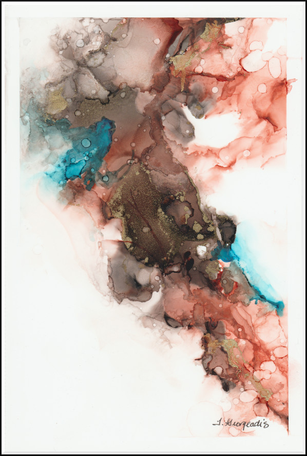
I’ve been experimenting lately with alcohol inks, trying out different ideas
on a wide range of sizes of Yupo paper. I love the fast, fluid way I can apply
and move around pigment, and I’m enjoying the excitement of the unexpected,
which describes this medium perfectly! I’m finding the most success sticking
to limited colours for each piece, in this case orange, blue and black:
©2020 Jennifer Georgeadis. 15cm x 23cm, ink on Yupo paper
©2020 Jennifer Georgeadis. 15cm x 23cm, ink on Yupo paper
June 15, 2020
The past few months have proven to be a bit of a challenge for me creatively, to say the least.
My saving grace has been the work I’ve been doing for a theatre production that is slated for
October (fingers crossed). There certainly has been a lot of variety in the kind of creative
work I’ve been doing for the production, from modelling faux food and planning the physical set,
to digitally painting nebulae. Even when I’m feeling a little lacking in inspiration, there’s
always a long list of things to be created for the play. Fortunately everything we need has
already been planned out, so it’s just a matter of simply getting down to work.
My most recent digital painting was the Milky Way, which will be used full-screen at the back of the stage to help illustrate a relatively brief scene. This was a fun and fairly quick painting to create. I painted it on a backdrop of the digital star field that my husband (and our production’s head of visual effects) created to run real-time during the play.
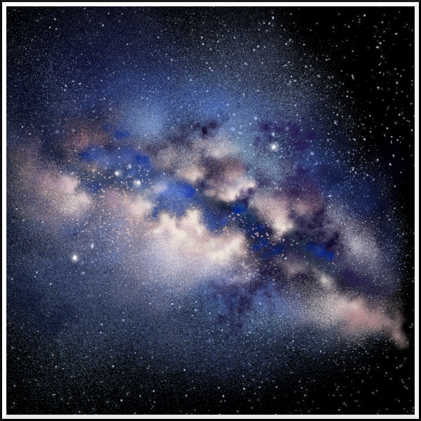
©2020 Jennifer Georgeadis.
My most recent digital painting was the Milky Way, which will be used full-screen at the back of the stage to help illustrate a relatively brief scene. This was a fun and fairly quick painting to create. I painted it on a backdrop of the digital star field that my husband (and our production’s head of visual effects) created to run real-time during the play.
©2020 Jennifer Georgeadis.
April 21, 2020
As we all know these are strange days, and I’m finding inspiration wherever I can,
sometimes from rather unusual places. One of the activities my husband and I are
really missing is going out to our favourite coffee places. The combination of a
really excellent coffee made by someone other than me is a decadent, wonderful thing.
In my case, I love a latte. I’m making a reasonable facsimile at home with instant
(I know, I know) espresso and half and half milk, which is not only delicious, but
happens to leave interesting patterns in the cup from the crema.
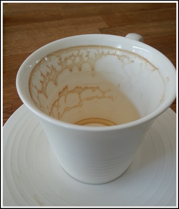
©2020 Jennifer Georgeadis.
Once I started really looking at these patterns I saw all kinds of shapes that looked like people, trees, animals and objects. Sometimes taken together the pattern seems to tell a story, sort of a hieroglyph in my pretty white coffee cup. The other day I was thinking I should sketch some of the more interesting ones. It’s not like I don’t have the time, right?
This was the first one I sketched. I'm calling it The Bridge:
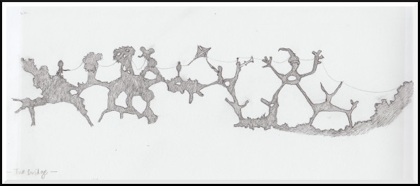
©2020 Jennifer Georgeadis. 30.5cm x 13cm, ink and graphite on sketchbook paper
©2020 Jennifer Georgeadis.
Once I started really looking at these patterns I saw all kinds of shapes that looked like people, trees, animals and objects. Sometimes taken together the pattern seems to tell a story, sort of a hieroglyph in my pretty white coffee cup. The other day I was thinking I should sketch some of the more interesting ones. It’s not like I don’t have the time, right?
This was the first one I sketched. I'm calling it The Bridge:
©2020 Jennifer Georgeadis. 30.5cm x 13cm, ink and graphite on sketchbook paper
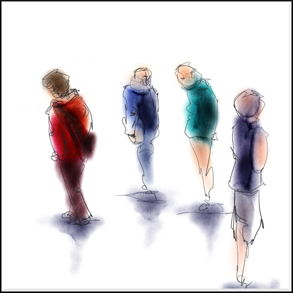
April 13, 2020
I’ve been doing some fun gesture drawing lately in the form of blind contour drawing.
For those who might not be familiar with it, blind contour drawing is an exercise that
helps train the eye to focus on the shapes and masses that form an object. The idea is
to follow the edge of your subject (in my case, a human figure) with your eyes while
simultaneously drawing that edge. Your eyes never leave the subject to glance at your
drawing, and you draw in one continuous line, never lifting the pen or pencil from the paper.
I would recommend this exercise to anyone, artist or not. The results are often hilarious, surprising, and sometimes humbling as you’ll see by my first three tries this week!!
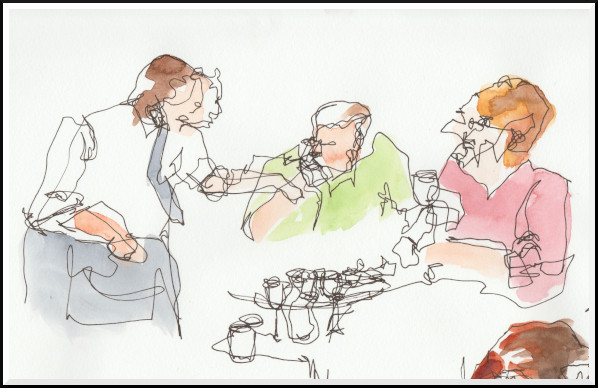
©2020 Jennifer Georgeadis. 22cm x 13cm, ink and watercolour on sketchbook paper
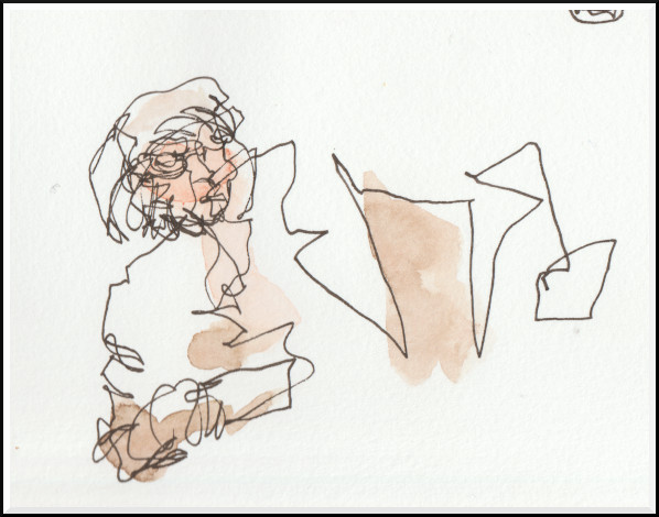
©2020 Jennifer Georgeadis. 11cm x 8cm, ink and watercolour on sketchbook paper
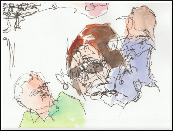
©2020 Jennifer Georgeadis. 16.5cm x 13cm, ink and watercolour on sketchbook paper
April 7, 2020
Sketchbook
March 20, 2020
Sketchbook
March 7, 2020
Sketchbook
February 29, 2020
Sketchbook
Older --->
© 2011-2022 Jennifer Georgeadis.
I would recommend this exercise to anyone, artist or not. The results are often hilarious, surprising, and sometimes humbling as you’ll see by my first three tries this week!!
©2020 Jennifer Georgeadis. 22cm x 13cm, ink and watercolour on sketchbook paper
©2020 Jennifer Georgeadis. 11cm x 8cm, ink and watercolour on sketchbook paper
©2020 Jennifer Georgeadis. 16.5cm x 13cm, ink and watercolour on sketchbook paper
April 7, 2020
Well, here I go again, modelling more faux food. Our theatre needed a couple of popsicles
to be used in a production, and the requirements were that one popsicle needed to be red,
the second should be any other colour, and that the popsicles needed to be durable enough
to be thrown onto the floor repeatedly over the play’s run. Yikes!
At least three-quarters of the time I spent making these went into blending just the right colours. I wanted to get those vibrant, juicy colours you see in popsicles, which entailed a bit of experimentation using my yellow, blue and red Crayola Model Magic. The red was somewhat simpler to make, although I needed to deepen the existing clay colour by adding just a small amount of blue. The green was a bigger challenge. I made a small experimental mix using a ratio of one part blue clay to 5 parts yellow and came up with a green that was just right, then made a larger batch that was popsicle-sized.
Before the clay set I inserted full-sized popsicle sticks, then did any neccessary re-shaping to the clay. It wasn’t until after the clay had set that it occured to me the sticks might very well snap off when the prop was thrown, so I used half-sized popsicle sticks and epoxy glue to reinforce the handles. These smaller sticks fit about an inch into the dried clay and helped make the handle much stronger while being nearly invisible.
After the glue dried completely I applied final touches to the popsicles by using acrylic paint to create some dimension, using slightly darker red and green hues. Lastly, I applied an acrylic gloss medium to make the popsicles look wet.
I’m happy with the way these turned out, and I hope very much that they manage to survive the play’s three-week run!
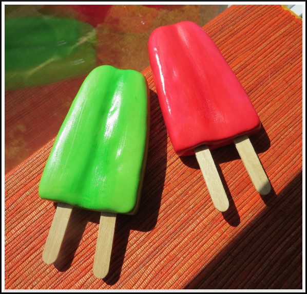
©2020 Jennifer Georgeadis.
At least three-quarters of the time I spent making these went into blending just the right colours. I wanted to get those vibrant, juicy colours you see in popsicles, which entailed a bit of experimentation using my yellow, blue and red Crayola Model Magic. The red was somewhat simpler to make, although I needed to deepen the existing clay colour by adding just a small amount of blue. The green was a bigger challenge. I made a small experimental mix using a ratio of one part blue clay to 5 parts yellow and came up with a green that was just right, then made a larger batch that was popsicle-sized.
Before the clay set I inserted full-sized popsicle sticks, then did any neccessary re-shaping to the clay. It wasn’t until after the clay had set that it occured to me the sticks might very well snap off when the prop was thrown, so I used half-sized popsicle sticks and epoxy glue to reinforce the handles. These smaller sticks fit about an inch into the dried clay and helped make the handle much stronger while being nearly invisible.
After the glue dried completely I applied final touches to the popsicles by using acrylic paint to create some dimension, using slightly darker red and green hues. Lastly, I applied an acrylic gloss medium to make the popsicles look wet.
I’m happy with the way these turned out, and I hope very much that they manage to survive the play’s three-week run!
©2020 Jennifer Georgeadis.
March 20, 2020
For our theatre’s most recent production I was asked to work on creating some props,
which is always an exciting prospect. The props mistress needed a couple of fried eggs
for a dinner scene, and at her suggestion I used a product that was new to me, Crayola
Model Magic, an air-drying modelling material that dries in roughly 24hrs. The advantage
of this material is that it dries to a light, almost spongy consistency that makes it a
bit more resilient to frequent handling than something like Sculpey.
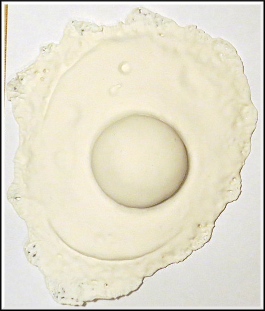
I started with a flattened ball of clay and shaped irregular edges and a slightly higher middle. I then formed a wide crater in the middle and shaped another ball of clay to form the yolk:
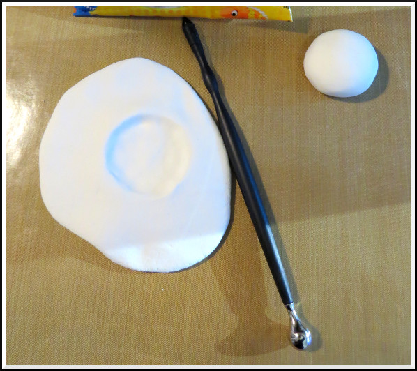
©2020 Jennifer Georgeadis.
I used my shaping tool to seal the edges of the yolk against the white of the egg, then worked on creating some interesting surface textures, including air bubbles and the thin scalloped edges of the white. I made two eggs in the same way:
©2020 Jennifer Georgeadis.
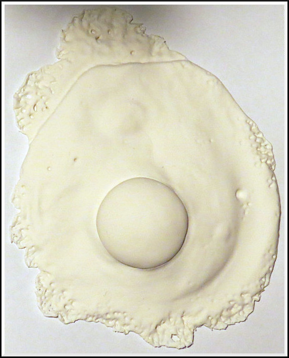
©2020 Jennifer Georgeadis.
Now to make the eggs look like eggs. I painted the yolks using a yellow-orange acrylic paint, then swirled in some darker orange while the base coat was still wet. I brushed on the same darker orange around the “crispy” edges of the whites, gradually darkening the paint to brown for the very tips. Once the paint was dry I brushed on a thin layer of acrylic gloss all over the eggs, giving the yolks a couple of coats for extra shine:
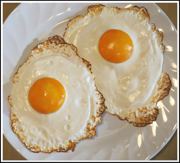
©2020 Jennifer Georgeadis.
Our props mistress was so pleased with the eggs that she asked for a pile of baby carrots as well. These I made using the same modelling material, but in this case I used a mixture of red and yellow clay to get just the right carrot-orange. Most of my work went into creating texture in the carrots, but I used a light wash of yellow acrylic paint to make the tips of several carrots a bit lighter. Finally I brushed on a light coat of acrylic gloss to make the carrots look moist:
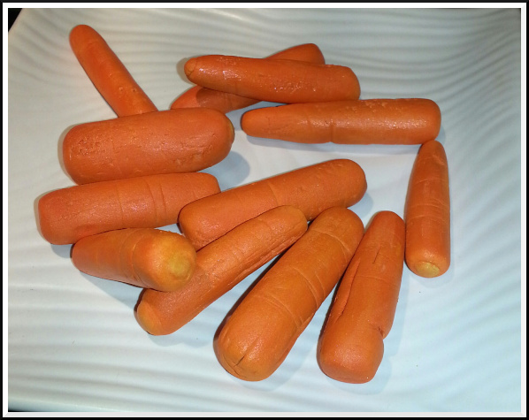
©2020 Jennifer Georgeadis.
I started with a flattened ball of clay and shaped irregular edges and a slightly higher middle. I then formed a wide crater in the middle and shaped another ball of clay to form the yolk:
©2020 Jennifer Georgeadis.
I used my shaping tool to seal the edges of the yolk against the white of the egg, then worked on creating some interesting surface textures, including air bubbles and the thin scalloped edges of the white. I made two eggs in the same way:
©2020 Jennifer Georgeadis.
©2020 Jennifer Georgeadis.
Now to make the eggs look like eggs. I painted the yolks using a yellow-orange acrylic paint, then swirled in some darker orange while the base coat was still wet. I brushed on the same darker orange around the “crispy” edges of the whites, gradually darkening the paint to brown for the very tips. Once the paint was dry I brushed on a thin layer of acrylic gloss all over the eggs, giving the yolks a couple of coats for extra shine:
©2020 Jennifer Georgeadis.
Our props mistress was so pleased with the eggs that she asked for a pile of baby carrots as well. These I made using the same modelling material, but in this case I used a mixture of red and yellow clay to get just the right carrot-orange. Most of my work went into creating texture in the carrots, but I used a light wash of yellow acrylic paint to make the tips of several carrots a bit lighter. Finally I brushed on a light coat of acrylic gloss to make the carrots look moist:
©2020 Jennifer Georgeadis.
March 7, 2020
Here’s another very quick figure study using digital watercolour and ink:
©2020 Jennifer Georgeadis. 10cm x 10cm, digital watercolour and ink
©2020 Jennifer Georgeadis. 10cm x 10cm, digital watercolour and ink
February 29, 2020
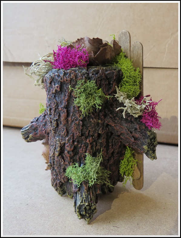
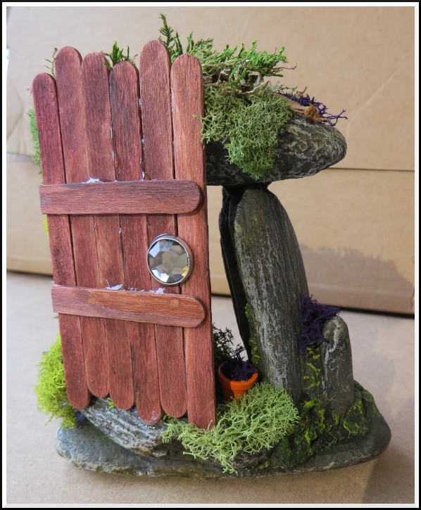
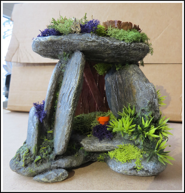
One of the other big projects I had in December was creating fairy doors and a few other pieces to accompany them.
When I read about fairy doors I thought the idea was so appealing, and a great way to brighten up a long winter.
Although fairy doors are often fairly basic, I wanted to create something a bit more substantial that could be free-standing. I found a couple of interesting-looking aquarium decorations as the base, then made my fairy doors out of craft popsicle sticks that I stained before assembling. The last step was to glue on some decorative moss.
Here are the two fairy doors, front and back:
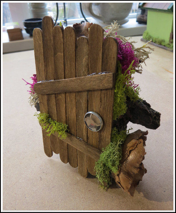
©2020 Jennifer Georgeadis.
©2020 Jennifer Georgeadis.
©2020 Jennifer Georgeadis.
©2020 Jennifer Georgeadis.
A fairy village sign post seemed like a good idea:
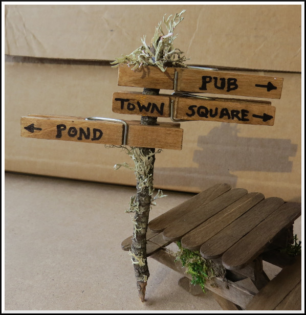
©2020 Jennifer Georgeadis.
There of course needs to be a few places to sit...
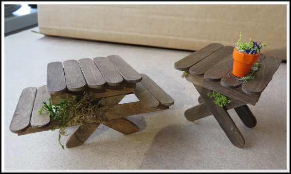
©2020 Jennifer Georgeadis.
...and somewhere handy to hang the wash up to dry:
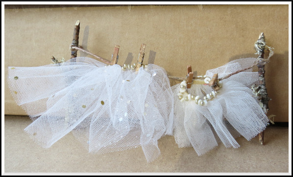
©2020 Jennifer Georgeadis.
This project was a lot of fun, and rather addictive!
Although fairy doors are often fairly basic, I wanted to create something a bit more substantial that could be free-standing. I found a couple of interesting-looking aquarium decorations as the base, then made my fairy doors out of craft popsicle sticks that I stained before assembling. The last step was to glue on some decorative moss.
Here are the two fairy doors, front and back:
©2020 Jennifer Georgeadis.
©2020 Jennifer Georgeadis.
©2020 Jennifer Georgeadis.
©2020 Jennifer Georgeadis.
A fairy village sign post seemed like a good idea:
©2020 Jennifer Georgeadis.
There of course needs to be a few places to sit...
©2020 Jennifer Georgeadis.
...and somewhere handy to hang the wash up to dry:
©2020 Jennifer Georgeadis.
This project was a lot of fun, and rather addictive!